Robert Triggs / Android Authority
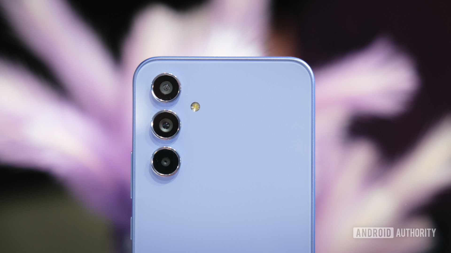
Galaxy A54 5G camera trio
Hmmm, I can’t remember the Samsung handset I selected for the picture above. Is it the latest Galaxy S23 flagship? Or perhaps the new mid-range Galaxy A54 or even the budget-friendly Galaxy A34?
Unlike last year’s models, it’s virtually impossible to tell precisely which Galaxy model we’re looking at, even with a studious glance. While perhaps not the most groundbreaking change to the Galaxy A series ever, it is an important win not only for customers at the affordable end of the market but for Samsung’s brand awareness too.
A unified Galaxy design strengthens the Samsung brand.
Build materials and not “confusing” consumers aside; there’s never been a great reason why affordable phones have to look, well, budget. Glassic backs have long opened the door for phones that look premium without the attached costs (and feel) of the most expensive models. A shared design language up and down the price ladder doesn’t cheapen Samsung’s brand, either. In fact, it strengthens the message that you aren’t downgraded to a second-class customer simply for buying on a budget. You’re buying a Samsung phone, after all, so why shouldn’t they look alike?
Sony has understood this reasonably well, with a common look spanning its Xperia 1, 5, and 10 models recently. Apple, of course, ensures an instantly recognizable look across its portfolio, from the iPhone 14 Pro Max down to the little iPhone SE 3. But too few others establish this connection.
Speaking of, Samsung’s latest redesign actually one-ups Apple’s budget offering. 2022’s iPhone SE 3 is unmistakably Apple, but it’s 2017’s Apple, right down to the gargantuan bezels and outdated button fingerprint scanner. If you want an affordable iPhone, you must settle for an outdated look. Meanwhile, Samsung’s Galaxy A54 and A34 customers get their hands on an up-to-date design.
The iPhone SE is dated, while Samsung gives its midrange customers the latest and greatest.
That isn’t to say Samsung hasn’t had to make compromises somewhere. The triple camera system, for instance, disguises what will almost certainly turn out to be a mostly useless 5MP macro camera in place of the S series’ telephoto lens. The display bezels on the front are still on the chunky side, there’s no wireless charging or metal frame, and decidedly lower-end chipsets are buried inside. But those are all compromises we expect to keep prices down, and certainly don’t just apply to Samsung’s A series.
What’s more important is that the Galaxy A54 and A34 don’t just look like a central part of Samsung’s ecosystem; they benefit from the same attention to detail and core user experience as the S series too.
Both new Galaxy A models ship with Samsung’s One UI 5 (based on Android 13) out of the box. Gone are the days of dated software and putting up with old features when shopping on a budget. The phones are also eligible for Samsung’s Android-leading update pledge of four major Android upgrades and five years of security patches. That’s every bit as good as all of Samsung’s flagship phones for a fraction of the price.
A unified design language across the Galaxy A and S ranges isn’t just about the looks, then. It reinforces that Samsung wants to create a more consistent, cohesive experience across its entire smartphone portfolio. We’ll have to wait until we review the handsets to see whether this intention bears fruit, but this certainly feels like a long-overdue step forward.
What do you think about the Galaxy A series redesign?
81 votes


Discussion about this post