


Rick Willoughby
Australia’s mostly government funded scientific research organisation, CSIRO, has participated in the United Nations IPCC program to identify human impacts on climate. CSIRO has contributed to the various assessment reports through evolving climate models over the past 20 years.
This article examines how well the CSIRO climate models serve the Australian community that fund their work.
El Nino Southern Oscillation (ENSO)
The phases of the Tropical Pacific have a significant impact on the weather that most Australians experience. The Eastern States of Australia, where most of the population live, experience dry and hot conditions during the El Nino phase that often result in droughts while the La Nina phase is associated with higher rainfall and often regional flooding.
This statement from the Australia Bureau of Meteorology:
Australia’s weather is influenced by many climate drivers. El Niño and La Niña have perhaps the strongest influence on year-to-year climate variability in Australia. They are a part of a natural cycle known as the El Niño–Southern Oscillation (ENSO) and are associated with a sustained period (many months) of warming (El Niño) or cooling (La Niña) in the central and eastern tropical Pacific. The ENSO cycle loosely operates over timescales from one to eight years.
Identification of the Pacific phases dates back to the 17th century when South American fishermen observed warmer waters off their coast during the El Nino phase resulting in the origin of the phase names. Henry Blanford, the Imperial Meteorological Reporter to the government of India, identified a connection between dry conditions in India and other regions of the globe associated with ENSO phases in the late 1800s. A statistical connection was formalised in the 1920s.
The best indication of the shifting phases is the ocean surface temperature in the central Pacific identified as the Nino 3.4 region that extends across the equator from 5S to 5N and along the equator from 120W to 170W. There are reliable Nino 3.4 surface temperature records dating back to the late 1800s because of the regions importance to global weather.
Nino3.4 Satellite Sea Surface Temperature
Satellite based monitors have been providing high spatial resolution spectral data as the basis for determining the sea surface temperature globally since the early 1980s. The US based centre for environmental prediction (NCEP) produces a sea surface temperature data set that uses the satellite data to interpolate between surface based measurements at moored buoys; combining the accuracy of in-situ measurements with high spatial resolution. Chart 1 plots the NCEP interpolated data for the Nino 3.4 region throughout the satellite era.
The measured temperature has averaged 27C for the 42 years of the data collection and currently has a slight downward trend of 0.63C/century. El Nino phase is associated with regional temperature above 28C while La Nina phase is present when the temperature is below 26C. The significant El Nino occurrences around 1982, 1998 and 2016 stand out in the plot.
Coupled Model Intercomparison Project (CMIP)
The CMIP framework dates back to 1995 and set an agreed basis for the inputs to climate models produced by numerous research groups around the world for comparing their model output.
CMIP3
CMIP3 was established for the third assessment report that projects climate state from the year 2000. The Special Report for Emissions Scenarios (SRES) provided a number of scenarios with a range of inputs but only two are noted here:
- SRES A1b projects atmospheric CO2 to reach 703ppm by 2100
- SRES A2 projects CO2 to reach 836ppm by 2100
Chart 2 shows the surface temperature prediction for the Nino34 region produced by CSIRO’s Mk3.0 model using the worst case SRES A2 scenario:
The model output starts 3C below the measured average temperature at year 2000 then reaches the current average by 2100. So, although the there is a warming trend of 2.79C/century, the modelled temperature under the worst case CO2 emissions only reaches the present temperature by 2100. The upward trend of the model output during the 23 year overlap with measured data is 4.19C/century compared with measured cooling trend of 0.51C/century.
CMIP5
By 2007 and the fifth assessment report, the emission scenarios had been renamed to Representative Concentration Pathways (RCP). The CO2 emissions associated with the pathways are:
- RCP 2.6 projects CO2 to reach 421ppm by 2100
- RCP 4.5 projects CO2 to reach 538ppm by 2100
- RCP 6 projects CO2 to reach 670ppm by 2100
- RCP 8.5 projects CO2 to reach 936ppm by 2100
Chart 3 shows the predicted temperature for the Nino 3.4 region based on CSIRO’s Mk3.6 model using the RCP 8.5 scenario.
Chart 3 has hindcasting back to 1980 where the average is 3C below the measured average at that time but ends up averaging 29C by 2100 to give a linear upward trend of 4.48C/century. The model produces a warming trend from 1980 to 2023 of 1.85C/century compared with measured cooling trend of 0.63C/century.
CMIP6
The emission scenarios for the sixth assessment report were set out in 2015 as Shared Socioeconomic Pathways (SSP) with CO2 emissions as listed:
- SSP126, 440ppm by 2100
- SSP245, 600ppm by 2100
- SSP370, 860ppm by 2100
- SSP585, 1130ppm by 2100
Chart 4 shows the predicted surface temperature in the Nino3.4 region for SSP585 from CSIRO’s ACCESS CM2 model:

Chart 4 also displays hindcasting to 1980. The overlap with measured data has a warming trend of 1.72C/century, which is in the opposite direction to the cooling trend of 0.63C/century with measured data. The starting temperature of 26C is now closer to the measured average of 27C while the temperature averages 31C by 2100. By 2080, the model is predicting regional open ocean surface temperature to sustain temperature above 30C. This is physically impossible with the current atmospheric mass.
The maximum sustainable temperature of 30C is regarded as well known. It has been stated in scientific literature dating to the 1970s. A 1991 paper by Ramanathan and Collins even linked the temperature regulation to cirrus cloud formation. It also appears that the Russian INM model is consistent with this limit as shown in Chart 5.

Chart 5 displays the surface temperature prediction for the Nino3.4 region under the worst case scenario. It starts well below the current average but reaches the current average by 2100. It has a warming trend of 2.73C/century, which is opposite direction to the observed cooling trend. However it does not predict the physically impossible like the CSIRO’s ACCESS model.
Open Ocean Temperature Limit of 30C
It is possible to now observe the way that oceans and the atmosphere above limit heat input to regulate the open ocean surface temperature on a daily basis looking at ocean warm pools using satellite data. There is also historic data recorded by ocean moored buoys that provide surface level observation at specific locations. Chart 6 examines surface temperature data for the moored buoy in the middle of the Bay of Bengal located at 15N, 90E.

The chart covers an annual cycle for two years 10 years apart with daily temperature readings. The chart includes the calculated monthly top of the atmosphere solar EMR. The solar EMR is almost constant at 15N through May, June, July and August. In 2008, the temperature regulation began shortly after the surface reached 30C around day 120 then continued to regulate till almost day 300. In 2018 the temperature overshot to almost 32C before the regulation set in around day 150 and continued regulating to day 280.
Chart 7 includes the measured surface insolation for 2018 to clearly show how the cloud formation associated with the monsoon limits surface sunlight to hold the surface temperature at or just below 30C.

Near clear sky conditions prevail from day 30 through to day 150. The monsoon sets in around day150 and persists in steady cyclic mode till day 265 as the ToA solar EMR is reducing. During this period, the average surface insolation is 169W/m^2, which is only 39% of the ToA solar EMR. The temperature climbs under clear sky from day 265 to 280 till it exceeds 30C then cloud forms again to bring the temperature back under 30C. After day 300, the ToA solar EMR is too low for the surface to reach 30C.
Both the Bay of Bengal and Arabian Sea have limited northern extent and both regions of the Indian Ocean become warm pools through April and May before the atmosphere approaches equilibrium with the surface enabling convective instability causing the monsoon to set in. This contrast with the tropical western Pacific where warm pools persist most of the year as shown in Chart 8.

The tropical Atlantic is more constrained longitudinally and typically only approaches or reaches the 30C limit in late September as shown in Chart 9.

CSIRO Model Claims Versus Performance
The outputs of the various CSIRO models over the three assessment reports are not directly comparable because the highest CO2 emissions scenario has increased with successive reports. However the INM and CSIRO model comparison for CMIP6 with SSP585 emissions produce vastly different results with the INM a result closer to the measured data but still with a warming trend; opposite of what has been observed through the satellite era..
The description for CSIRO’s ACCESS climate model states the following:
Around the world there are over 100 global climate models available and used by international research teams to better understand our historical and future climate. Each climate model has different strengths and biases. Most climate models are developed by research groups in the Northern Hemisphere. As a result, these models may not always focus on the climate drivers and phenomena most important or relevant to Australia.
ACCESS equips Australia with the ability to focus on global climate as well as the weather and climate of the Australasian region and the Southern Hemisphere. The development of ACCESS has also built the capability and capacity of Australian researchers and technicians in climate science, observations and highperformance computational modelling. This means that Australia has the modelling capability to be able to conduct its own global and regional climate experiments using ACCESS and can critically assess the results of climate experiments done by others internationally.
The measured data shows that the ACESS model falls a long way short of achieving anything of value for weather and climate prediction in Australia. It does not come close to forecasting the ENSO phases that are so critical to climate states in Australia. The Russian INM model is at least in the ballpark and does not make unphysical projections.
With regard the Southern Hemisphere, it has been experiencing lower peak ToA solar EMR since 1600. This is now reflected in cooling trend in the Southern Ocean of 0.64C/century since 1980. The ACCESS climate model has a warming trend of 3C/century in the Southern Ocean – again, the trend is in the wrong direction.
The CSIRO and its ACCESS modelling team are no longer serving Australia. Rather they are deeply embedded in the corruption of science evident in climate models they claim are useful but are clearly not. This is what the ACCESS Team claimed for the CMIP6 results:
ACCESS models and expertise of researchers has helped significantly to understand Australia’s future climate, as part of the International Coupled Model Intercomparison Project (CMIP6)
Only a scoundrel with a gullible audience could make such stupid, untestable claim about the future. The modelling CSIRO did back in 2000 that now has 23 years of testable output is far from validated. The current ACCESS model clearly produces unphysical nonsense.
Climate Change
Climate has always changed. One of the major flaws with climate modelling is that the modellers arbitrarily choose a pre-industrial starting point with the assumption that there was a state of climate equilibrium at that point in time. In reality, there is compelling evidence that following the regional peak sunlight gives insight into the direction of observed climate trends.
The output of the sun varies slightly through the 11 year solar cycle however there is large spatial and temporal variation in solar EMR reaching the top of Earth’s atmosphere due to its orbital relationship with the sun. Chart 10 shows the variation in monthly average ToA solar EMR as a function of latitude for selected months in 2023.

The location with the highest monthly ToA solar EMR is the North Pole currently averaging 520W/m^2 in June. As observed in Chart 6 above, the four months shown have close to the same monthly average solar EMR at 15N. Note that there is a mid latitude peak in June located at 44N.
Chart 11 examines how the peak daily mid latitude ToA solar EMR has changed over time and will change in the future. The peak daily solar intensity usually coincides with the summer solstice.

The lowest peak daily solar EMR of 483.7W/m^2 occurred at 44N in 1584. It is now at 483.9W/m^2 and will reach its next high of 505.4W/m^2 in 10900.
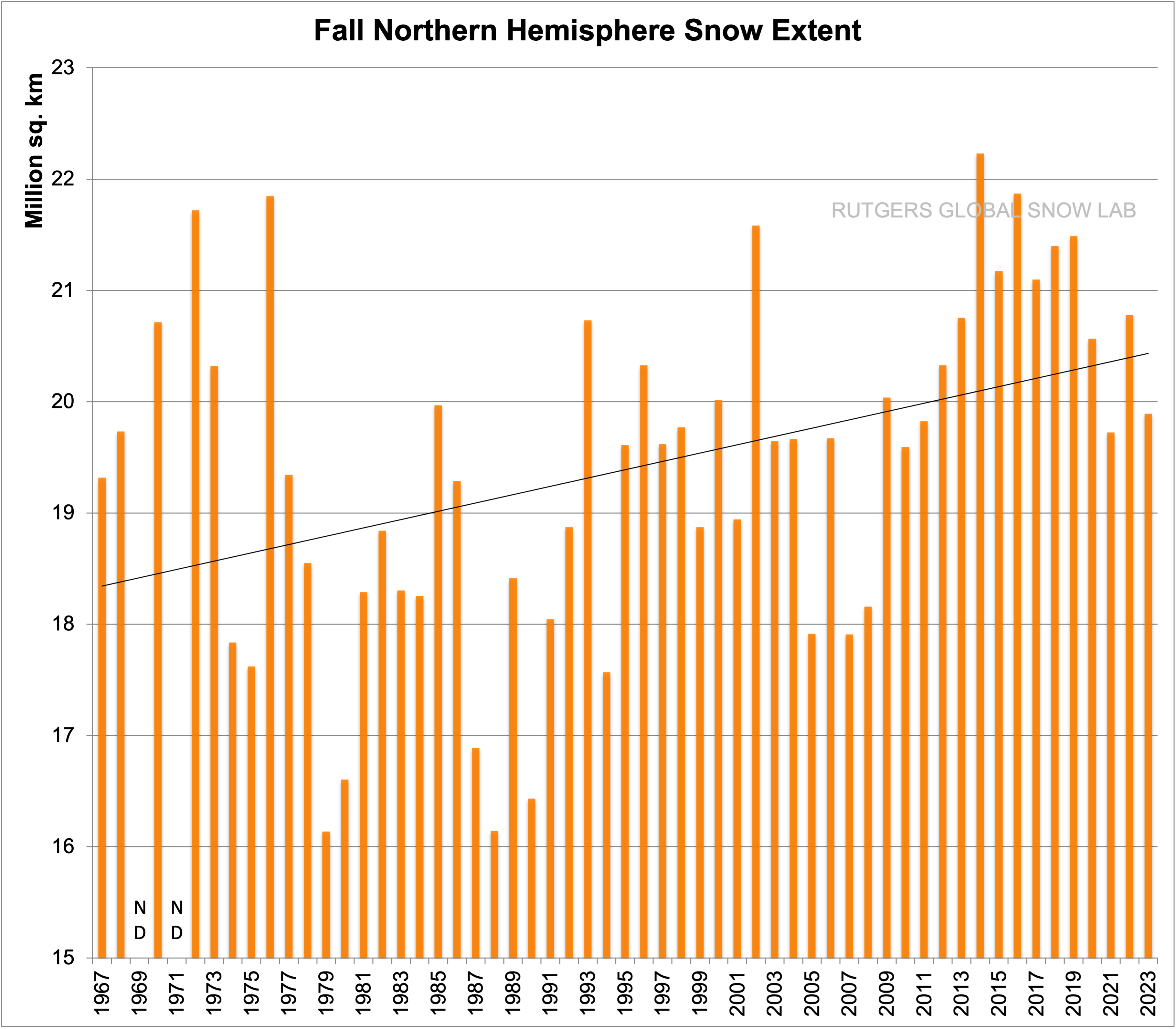
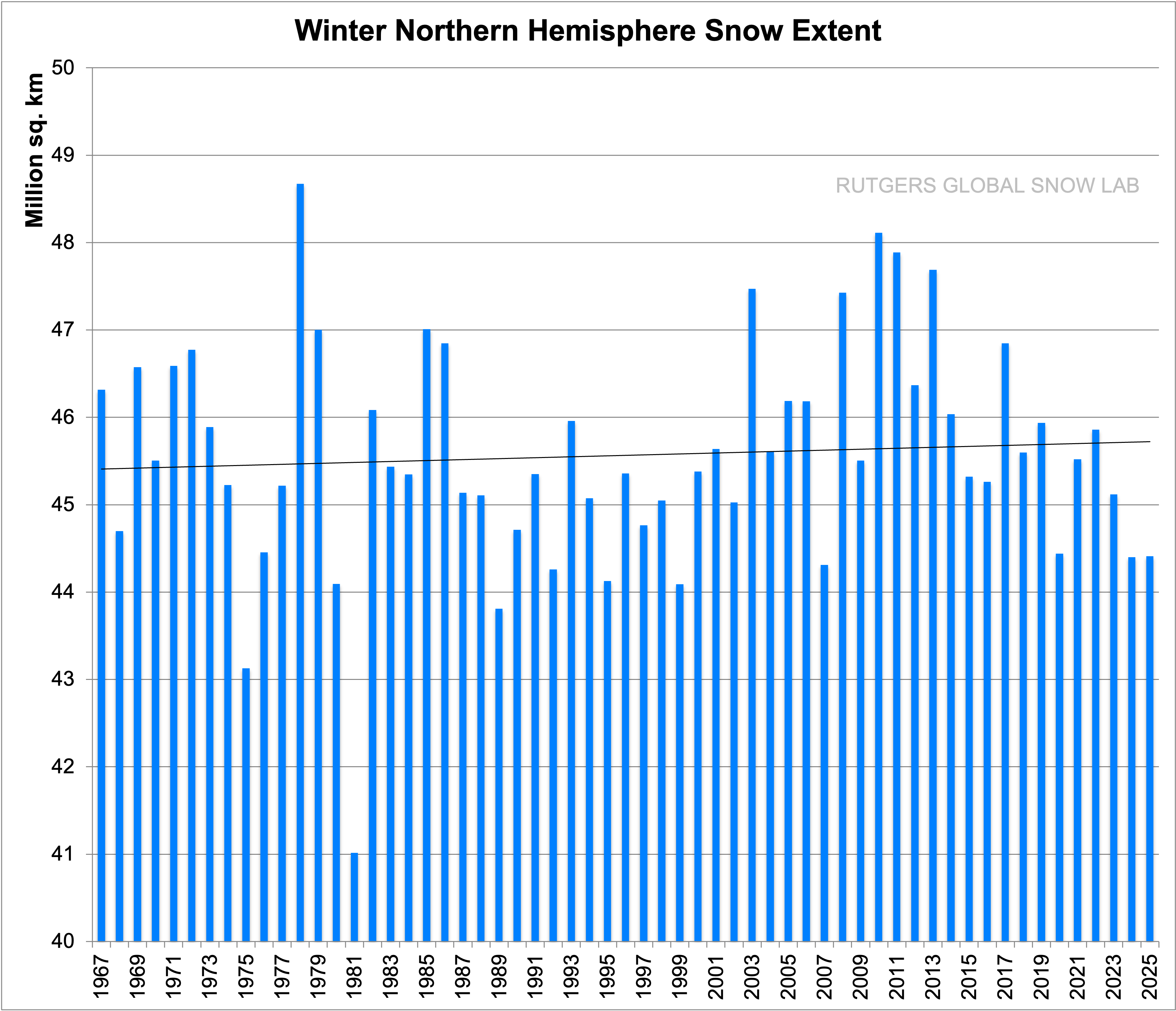
The lowest peak solar EMR coincides with historically low recorded temperatures in the NH as well as other evidence of a cold period commonly known as the Little Ice Age. The NH has been warming now for at least 200 years based on the slow rise in sea level over the past two centuries. Autumn snowfall and extent across the NH has been trending up for at least 70 years consistent with warmer NH ocean surface in late September. The maximum extent of snow coverage is also trending up. The Southern Ocean has already started to cool as the SH peak solar EMR declines.
The region with the most rapid rise in seasonal temperature is the Greenland Plateau in January; displayed in Chart 12.

The trend over the satellite era is upward at 9.1C/century. This can only be the result of increased winter ocean air advection resulting in increased snowfall. The elevation of the plateau has indeed increased 170mm in the past decade. Hindcasting in the CSIRO ACCESS model with CMIP6 SSP585 emissions scenario for the same region yields a January trend of just 3.9C/century. This highlights the inability of the ACCESS model to predict observed changes in the region exhibiting the most warming since 1980.
The proportion of ocean surface reaching 30C is increasing as the NH ocean surface warms up in response to increasing peak ToA solar EMR. The ocean area reaching 30C in April, before the Indian monsoon sets in, has increased by 30% over the two decades from 2003 to 2023. This trend will continue due to the increasing peak solar intensity across the NH.
Climate has always changed and will continue to change. Climate modellers are not providing any useful insight into why climate has changed. The ACCESS model produces unphysical nonsense that has no relationship to observations or even produces plausible projections.
The Author
Richard Willoughby is a retired electrical engineer having worked in the Australian mining and mineral processing industry for 30 years with roles in large scale operations, corporate R&D and mine development. A further ten years was spent in the global insurance industry as an engineering risk consultant where he developed an enduring interest in natural catastrophes and changing climate.


