One of the best ways to master Google Sheets — the powerful spreadsheet app that you use in a web browser — is to learn how to build and use pivot tables.
To describe it very generally, a pivot table takes data from a group of cells in your spreadsheet and presents it in more comprehensible and interesting ways.
Pivot tables are mainly used to compile number data in cells, but they can also manipulate text data. And they’re most helpful when they’re used to extract cell data from a spreadsheet that has lots of columns or rows.
Why use pivot tables?
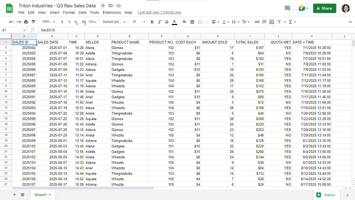
The best way to explain what a pivot table does, and why you would want to create one, is to show examples. Below is a spreadsheet of “raw” cell data that hasn’t been organized. Note the two columns that list the product names and the amounts of each product that were sold. Sales for the same product names were entered multiple times, so it’s impossible to tell at a glance the total sales for each product type.
 Howard Wen / IDG
The raw data in this spreadsheet is hard to decipher. (Click image to enlarge it.)
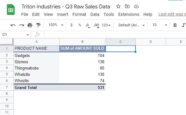
Here is a pivot table that was created from this spreadsheet. It’s been designed to summarize the total amounts of each type of product sold:
 Howard Wen / IDG
This pivot table adds up the amounts of each product sold, showing overall totals.
The table compiles all the data from the PRODUCT NAME column and all the data from the AMOUNT SOLD column, placing them neatly together for a focused view of how many of each product sold — data that’s very hard to see in the original spreadsheet.
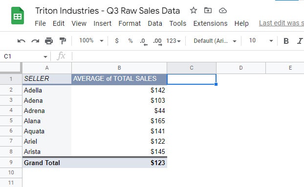
In our second pivot table example, below, we see the average of total sales of products that have been credited to each salesperson. Again, the pivot table pulls out information that’s impossible to quickly glean from the original spreadsheet.
 Howard Wen / IDG
This pivot table computes the average sale value for each salesperson.
Preparing your spreadsheet for pivot tables
In order to make useful pivot tables in Google Sheets, it’s best to prepare your spreadsheet for them. The spreadsheet should have the following ideal factors in its formatting:
- It contains “raw” data — that is, the spreadsheet lacks charts, graphics, tables, or other miscellaneous elements.
- There are no empty columns or rows between columns/rows that contain data inside their cells.
- The columns or rows that you select for the pivot table to compile data from have clearly worded headers. Although you can manually select specific columns or rows, it’s best if the pivot table is allowed to extract all the cell data that appears on a spreadsheet. Clearly worded headers make that easier.
Basically, the simpler and more straightforward your spreadsheet is, the better.
To prep your spreadsheet so that it can be used to generate pivot tables easily, first make a copy of the spreadsheet file — or make a duplicate of the sheet with the cell data that you want to manipulate in a pivot table.
To make a copy of your spreadsheet: Open the spreadsheet in Google Sheets. On the upper left, select File > Make a copy. On the panel that opens, enter a new name for the copy and click Make a copy. A new browser tab will open with the new copy of your spreadsheet.
To duplicate a sheet in your spreadsheet: Open the spreadsheet in Google Sheets. Along the bottom of your spreadsheet, click the down arrow on the tab of the sheet that you want to duplicate. From the menu that opens, select Duplicate. A copy of this sheet will then be added to your spreadsheet, set to the right of the original sheet.
 Howard Wen / IDG
Creating a duplicate sheet in a spreadsheet.
To give the new sheet copy a unique name, click the down arrow on its tab. From the menu that opens, select Rename and type in a new name.
Then you can edit the copy of your spreadsheet or sheet without altering the original. Delete all charts, graphics, tables, and other miscellaneous elements. Delete empty columns and rows. And check and update the names of the headers of the columns and rows.
Using the Explore tool to create a pivot table
When your spreadsheet is open in Google Sheets, the Explore icon on the lower right may appear as green. This means that Google’s Explore tool has a suggested pivot table for you. Clicking this icon will open the Explore sidebar along the right side.
Scroll down to the PIVOT TABLE section of the sidebar to see a thumbnail of a pivot table that was generated by Google Sheets. Clicking MORE (if this word appears; it might not) will show you more pivot tables created by Google Sheets.
 Howard Wen / IDG
Google’s Explore tool may suggest pivot tables for your sheet. (Click image to enlarge it.)
Move the pointer over the thumbnail of a pivot table. Two icons will appear over the upper right of the thumbnail:
 Howard Wen / IDG
Click the grid icon to insert the pivot table onto your sheet or the magnifying glass icon to get a closer look.
The grid icon: This will place the suggested pivot table on your spreadsheet. You can select to have the pivot table set onto the current sheet you’re viewing, or onto a new sheet.
In most instances, it’s best to place a new pivot table onto a new sheet — whether it’s a pivot table suggested by this Explore tool, or one that you create from scratch (which this guide will delve into below). Setting a pivot table onto a sheet that already has cell data on it can make the whole sheet appear confusing and difficult to manage. It might mess up the operations of the pivot table, too.
The magnifying glass icon: This will open a larger image of the pivot table thumbnail over your spreadsheet. This gives you a better preview of the suggested pivot table.
Creating a pivot table from scratch
If you don’t see a pivot table you want to create in the Explore sidebar, it’s easy to create your own. You can either select the columns or rows in the spreadsheet that you want the pivot table to extract data from (including their headers), or you can try skipping this step, especially if you’ve edited the spreadsheet according to the suggested formatting described earlier.
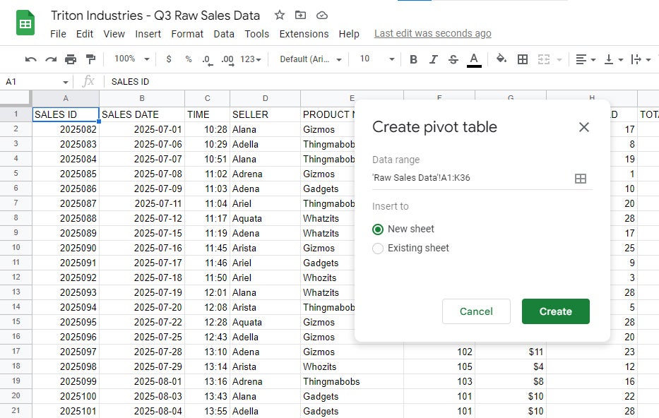
Then on the menu bar over your spreadsheet, select Insert > Pivot table. A “Create pivot table” pane appears. If you selected certain cells in the sheet to extract data from, that selection will appear in the “Data range” field. If you didn’t select any data, that field will show the full spreadsheet data set.
 Howard Wen / IDG
Creating a new pivot table. (Click image to enlarge it.)
As mentioned above, it’s better to insert your pivot table to a new sheet, so leave “New sheet” selected, then click Create.
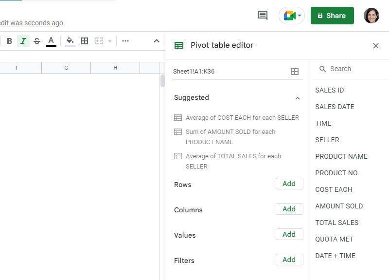
You’ll be taken to a new sheet with the “Pivot table editor” sidebar open along the right side. The editor has two columns. The right column has a search box along its top. Below this, it lists the headings of the columns or rows that you selected for this pivot table to extract cell data from — or, if you didn’t select any columns or rows, it lists all the headers in the sheet. This search column is helpful for finding a specific header on your spreadsheet that you want to include in your pivot table, especially if your spreadsheet is extremely large.
 Howard Wen / IDG
The pivot table editor helps you build pivot tables using labeled columns and rows from your raw data sheet. (Click image to enlarge it.)
In the left column of the pivot table editor, you’ll likely see a few pivot table suggestions that Google Sheets has parsed from your data set. These will likely be the same suggestions that appeared in the Explore sidebar earlier. In our product sales example, Sheets suggests “Average of COST EACH for each SELLER,” “Sum of AMOUNT SOLD for each PRODUCT NAME,” and “Average of TOTAL SALES for each SELLER.” Click any of them to see that complete pivot table.
Below that you’ll find four types of elements you can add to the pivot table manually:
Rows and Columns
When you click the Add button to the right of the “Rows” or “Columns” items, a menu will open listing the headings of the columns and rows in the data range for this pivot table. The cell data under the heading you select will be added to your pivot table as rows or columns.
Somewhat confusingly, if you add a Rows element, a column will be created for the heading you select, and its cell data will appear in rows underneath. If you add a Columns element, a row will be created for the heading you select, with its cell data appearing as columns to its right.
The Rows and Columns elements don’t perform calculations when they’re added to a pivot table, but they do remove duplicates.
In our sales example, going to Rows, clicking Add next to it, and selecting PRODUCT NAME from the pop-up menu adds a PRODUCT NAME column with the product names appearing as rows underneath. There’s just one row for each product name.
 Howard Wen / IDG
The pivot table now has a PRODUCT NAME column with a row for each product. (Click image to enlarge it.)
You’ll also see settings boxes for the elements you added appear under “Rows” or “Columns” in the pivot table editor. There are a few ways you can adjust these elements:
Order: Clicking this dropdown menu lets you select Ascending or Descending. For example, if the cell data under the heading for this row or column consists of numbers, then their values will be ordered as increasing (ascending) or decreasing (descending). If the cells contain text, then they will be listed in alphabetical order (ascending) or in reverse alphabetical order (descending).
Sort by: If there are two or more row or column elements in your pivot table, you can select which one takes precedence for the Order function, and the other rows or columns will follow it. At this point in our example we only have one column, so we’ll circle back to this function later.
Show totals: If the cell data under this heading consists of numbers and you check this box, then a row or column will be added to the pivot table that lists the total of these numbers.
To delete a rows or columns element, click the X on the upper right of its settings box.
Values
To perform calculations on the data in a pivot table, you’ll need to add a Values element. When you click the Add button to the right of the “Values” section, a menu will open listing the headings of the columns and rows in the data range for this pivot table. In most cases you’ll want to select a heading for a column or row with numerical values.
When you select a heading, a column with this heading will be added to your pivot table. The cell data under that heading will be calculated with a formula that you select.
When you add a values column to a pivot table, a settings box for it will appear in the “Values” section of the pivot table editor, with these functions:
Summarize by: Clicking this dropdown menu opens a menu of several calculation types. The ones you’ll probably use most are SUM and AVERAGE. If the cell data under the heading you’ve selected consists of numbers, then SUM will add up these numbers. AVERAGE will calculate the average of these numbers.
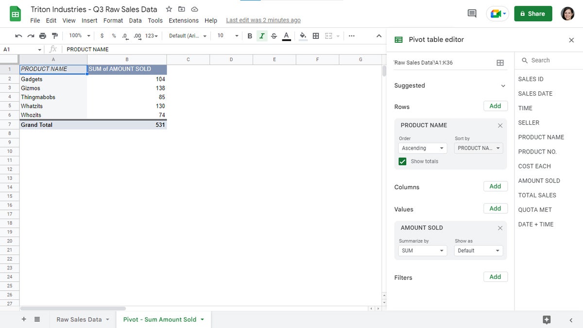
When you select a heading with numerical data underneath as you’re adding a value column, Sheets chooses the SUM function by default. In our sales figures example, going to Values, clicking its Add button, and selecting AMOUNT SOLD adds a “SUM of AMOUNT SOLD” column with the sales numbers for each product added up and shown next to each product name.
 Howard Wen / IDG
The pivot table now has a “SUM of AMOUNT SOLD” value column. (Click image to enlarge it.)
 Howard Wen / IDG
You can adjust the values in a value column to display as percentages instead of numerals.
Show as: By default, Sheets shows the calculations in a value column as numerals. This dropdown menu lets you instead display the values calculation as a percentage — representing a percentage of the row or column that the figure is in, or a percentage of a grand total.
To delete a value column, click the X on the upper right of its settings box.
Now that we have two columns displayed in our example pivot table, let’s take a quick detour back to the settings box for the Rows element we added. The items in the “PRODUCT NAME” column are listed in ascending alphabetical order. But if we now set the “Sort by” field to SUM of AMOUNT SOLD, then the numbers under the “SUM of AMOUNT SOLD” column will be listed in ascending order. The order of the items in the “PRODUCT NAME” column will shift to correctly correspond with their respective sales numbers.
 Howard Wen / IDG
Changing the “Sort by” dropdown to “SUM of AMOUNT SOLD” rearranges the rows in order of the numbers in the second column. (Click image to enlarge it.)
Filters
Filters let you exclude certain items or values in the original data set from your pivot table in order to present a cleaner, clearer set of data. For a complete guide to how filters work and how to make the most of them, see “Google Sheets power tips: How to use filters and slicers.” But here’s a quick overview of how to use them in pivot tables.
When you click the Add button to the right of the “Filters” section, a menu will open listing the headings of the columns and rows in the data range for this pivot table. Choose a heading for one of the elements (Rows, Columns, or Values) that you’ve already added to the pivot table. When you select a heading from this menu, a filter settings box for the heading will be added to the pivot table editor. To demonstrate this, we’ll add a filter for the PRODUCT NAME heading.
Each filter you add has a single “Status” function in its settings box. Click the dropdown menu that says Showing all items to open a panel that lets you filter the data under the heading that you selected.
 Howard Wen / IDG
In the PRODUCT NAME filter box, click Showing all items to see the filtering options.
There are two ways to filter: by values or by condition. Filtering by values lets you choose specific numbers or words that you want to include or exclude from the data set. You can use the search box on the panel that pops up from the filter’s settings box to search for numbers or words that appear in the cells under the heading that you selected. If you want a number or text item to appear in the pivot table, leave it checked. If you want to hide it, uncheck it. Then click OK.
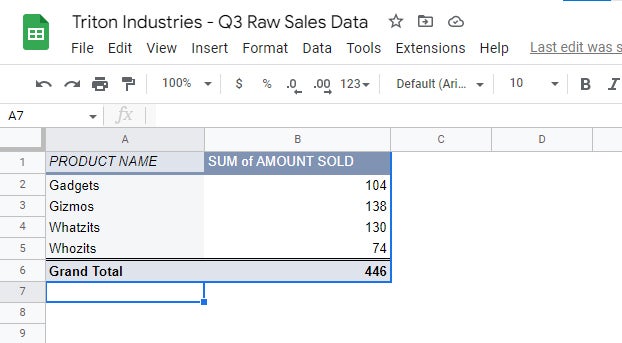
If you uncheck a number or text item, the row for the cell that contains the number or text you unchecked will be removed from the pivot table. Don’t worry — this row hasn’t been deleted. This filter you created has hidden this row, showing your pivot table without it. In the example below, we’ve unchecked Thingmabobs to exclude those sales figures from the pivot table.
 Howard Wen / IDG
The Thingmabobs row has been filtered out of the pivot table.
Filtering by condition lets you display only the data that meets certain criteria, such as containing certain words or having a value above or below a certain number. Let’s say you want to exclude any sales of less than 11 items from the totals in your pivot table. To do this, you’d filter the AMOUNT SOLD data to show only cells that contain numbers greater than 10.
In the Filters section, click the Add button and choose the AMOUNT SOLD header from the pop-up menu. In the AMOUNT SOLD filter box, click Showing all items. On the pane that appears, click Filter by condition, then click the box with None inside it. From the long menu list of filter variables that opens, scroll down and select Greater than. Inside the entry box below “Greater than,” type 10. Scroll to the bottom of the panel and click OK.
 Howard Wen / IDG
This filter will only include numbers greater than 10 when calculating the AMOUNT SOLD value column.
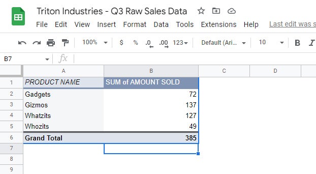
Now your pivot table shows calculations using only those cells from the data range in your original spreadsheet that contain numbers greater than 10. The cells in your original spreadsheet that contain numbers less than 10 are not used in the calculation for the pivot table.
 Howard Wen / IDG
The pivot table now shows lower numbers in the “SUM of AMOUNT SOLD” column, since all values of 10 or less are excluded from the calculations.
To delete a filter, click the X on the upper right of its settings box.
Managing your pivot tables
Edit a pivot table: Whenever you need to edit a pivot table’s settings, simply hover over the pivot table and click the Edit button that appears just below it. The sidebar for the pivot table editor will open along the right side. To close the sidebar, click the X on its upper right.
 Howard Wen / IDG
Hover over a pivot table and click the Edit button to open the pivot table editor at any time.
Keep pivot tables on separate sheets: Remember, it’s usually best to set each pivot table on a separate sheet to reduce clutter. This can also help make your overall spreadsheet more versatile: You can create several pivot tables — each set on its own sheet compiling the raw cell data from your main sheet differently from the other pivot tables. You can then switch among these different pivot tables by clicking through their tabs.
 Howard Wen / IDG
Keep pivot tables on separate sheets in your spreadsheet. (Click image to enlarge it.)
Copyright © 2023 IDG Communications, Inc.


Discussion about this post