Music streaming service Spotify is about to give its app a radical new redesign. And if, like me, you use Spotify just to get to your tunes as quickly as possible, you’re going to hate it.
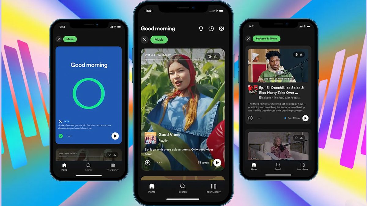
The Spotify app redesign goes heavy on video and imagery and is supposedly designed to make it easier for you to find not only new stuff (and formats) to listen to but new stuff to watch, too. I got a glimpse of the new-look app earlier this year, seemingly by chance, during what appeared to be an A-B test for existing premium subscribers. And it’s enough to make this loyal Spotify user consider becoming a full-time Apple Music subscriber.
If you’ve used TikTok or Instagram, it’ll feel familiar. Instead of your home screen showing you a condensed view of your most recent or most played albums and songs, along with playlist recommendations and ‘liked’ artists, you now get a vertical scrolling feed of cards that take up the majority of the screen, pointing you to curated content that also includes podcasts and video content.
Where’s the music?
It’s not that Spotify’s (usually excellent) recommendation engine will stop offering up things for you to listen to. But instead, where once you’d get dozens of recommendations on screen at glance to choose from, you’ll now only get one big splashy (data heavy) card at a time. If the new homescreen is designed to drive up user engagement metrics like active time on that homescreen, I’m sure it’ll work, albeit artificially — it’ll now take much longer to find the music you’ll actually want to listen to.
Not only that, but it seems to be actively making it harder to find music. Instead, podcasts and video shows are pushed more heavily, including its own originals — and it shouldn’t be lost on you that it’s much easier for Spotify to monetize its own content than that of the bands and musicians that have built the backbone of its platform over the past 15 years. It invested heavily in owning exclusive content (controversially so: see the Joe Rogan debacle), and so will be keen to recoup its costs here. For musicians that have already found it historically difficult to make a good buck from Spotify, I wouldn’t be surprised if this redesign makes things even worse.
There are some bright spots in the new look. Audio previews for tracks are more readily accessible, which is good for music discovery. And the in-beta AI DJ, with its synthesized voice and personalized radio is a unique idea, if ultimately just more window dressing for Spotify’s playlists. But where once it felt like thumbing through a record collection, Spotify now feels indistinct from any other ‘content’ platform.
The Apple Music alternative
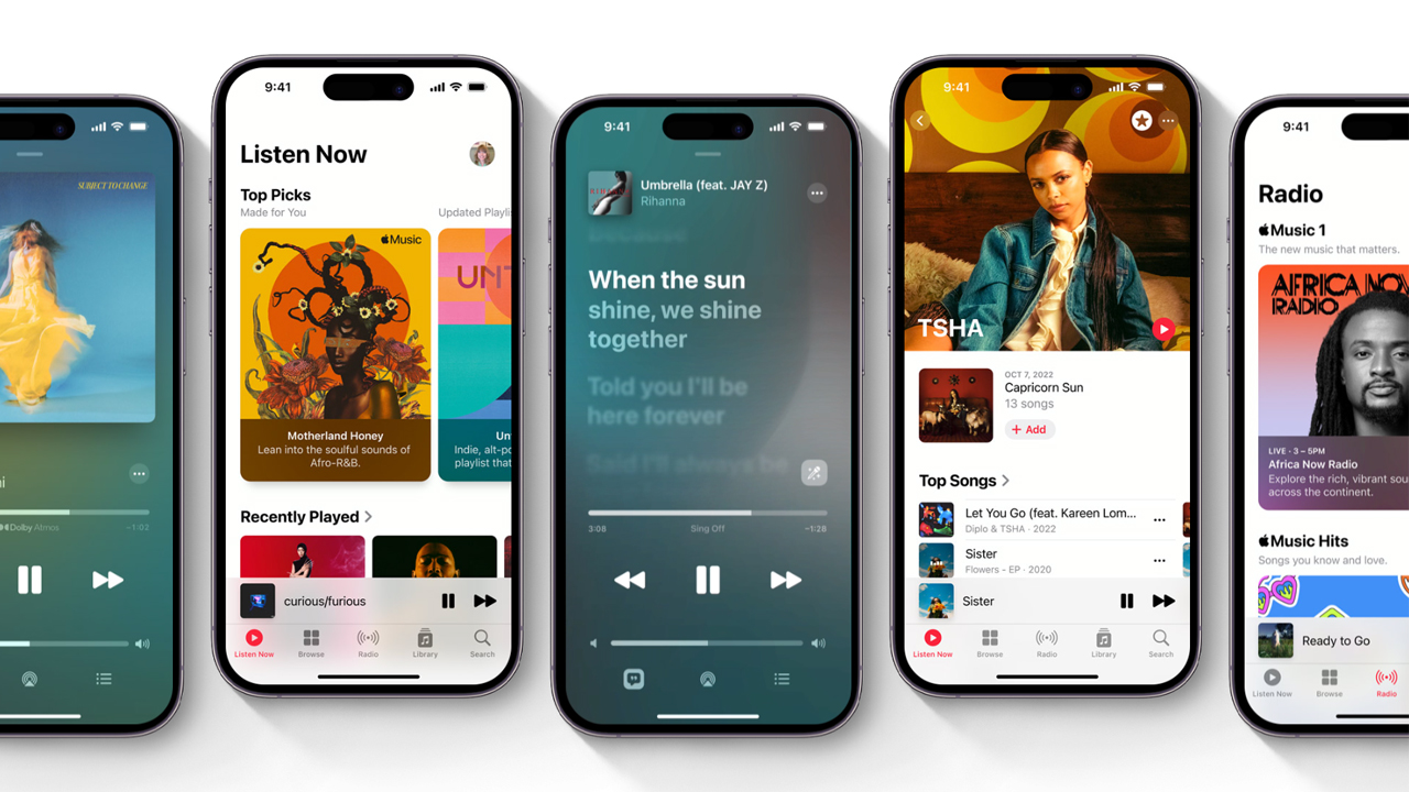
So what’s the alternative? For an iPhone user like me, the obvious answer is Apple Music.

It remains and retains a relatively clean interface, dedicated to music and basically little else, at a price competitive to Spotify — arguably more competitive if you pick up one of the Apple One subscription bundles that throws in Apple Arcade, Apple TV Plus, and other Apple subscription services at a reduced fee. And Apple Music has got some extras that Spotify itself can’t match at the moment, including lossless audio support for more detailed hi-res playback, and spatial audio support — essentially surround sound for your tunes, making it sound as if the production was coming at you from all sides, especially through headphones like the AirPods Max or Apple’s best true wireless earbuds, the AirPods Pro 2.
Apple is able to keep Music pure as it already has a diverse catalog of services and products, right through its App Store and hardware. It can spread development out across multiple platforms, and trust in them to be independently profitable. And so it has its own independent Podcasts, its own Books app, and is rumored soon to even have its own classical music app (a necessary spin-off, given the complexity of classical music meta data).
The times they are a-changin’
I appreciate Spotify has nowhere near the scale to do this, and so the focus must remain on its core app. But the search for never-ending user numbers and profits means that, unless it spins off its new ideas into untried-and-untested new apps, away from its current subscriber base, it must water down its core music streaming proposition.
And that makes me sad. I’ve been a Spotify user since its earliest beta days. It presented something truly revolutionary when it made (nearly) all the world’s music instantly accessible at the press of a button. For a music junkie like me, the first time I saw it was as close to a magical experience as I think I’ve ever had with tech. But after years of being a faithful Spotify subscriber, it might be time to take my ears elsewhere — and Apple Music seems to be hitting all the right notes for me.


Discussion about this post