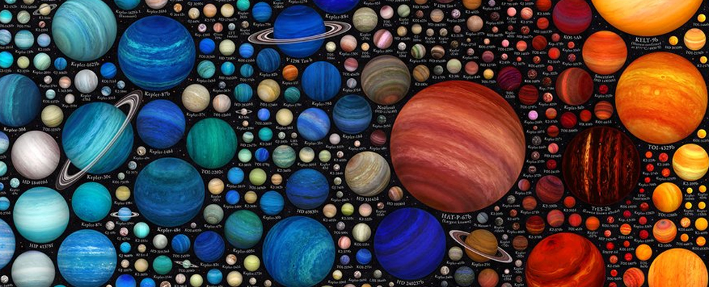
Martin Vargic is a space enthusiast, author, and graphic artist from Slovakia. He created two new infographic posters that show almost 1600 exoplanets of different types and sizes. One is called Icy and Rocky Worlds, and the other is called The Exoplanet Zoo.
Vargic has been interested in astronomy and space for as long as he can remember. When he was 10 years old, he used his family’s telescope to gaze at lunar craters, Jupiter’s moons, and Venus’s phases despite living in areas with lots of light pollution.
“On the rare occasions I got to see a clear sky and the Milky Way I was astounded by the sheer amount of stars,” Vargic told Universe Today.
In 2015, he devoured books on astronomy, cosmology, space exploration, and physics and created the first versions of what would eventually become these ambitious infographics. In 2019, after three years of work, Vargic published a visual book on the universe, astronomy, and space exploration called the “Curious Cosmic Compendium.”
In the Compendium, “10 pages were solely dedicated to exoplanets, with their temperature ascending page-by-page until transitioning to brown dwarfs and red dwarf stars,” Vargic told Universe Today.
All of that work led to these two new exoplanet infographic posters.
“With the help of scientific models and up-to-date information, this poster attempts to artistically visualize together over 1100 known exoplanets of all the different types we have discovered so far, arranged by the amount of heat they receive from their stars, comparing their relative sizes and providing a window to how they might look like,” Vargic explains on his website.
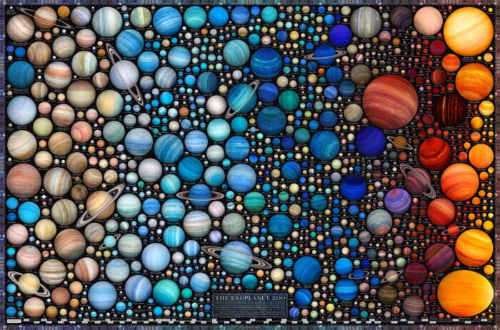
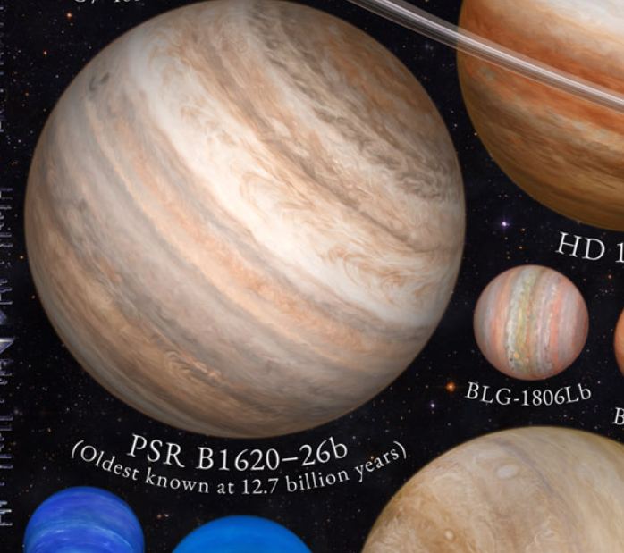
The poster shows exoplanets in all their weird and wonderful forms. It shows PSR-B1620-26b, the oldest known exoplanet.
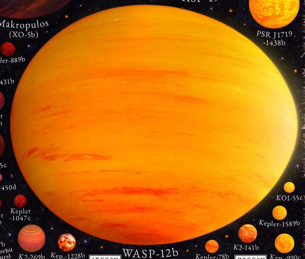
It also shows WASP-12b, a scorching hot gas giant so close to its star that it’s warped into an egg shape.
“Finishing both infographics took about 6-7 months. I worked on both simultaneously while creating planetary textures and rendering the planets one by one,” Vargic told Universe Today.
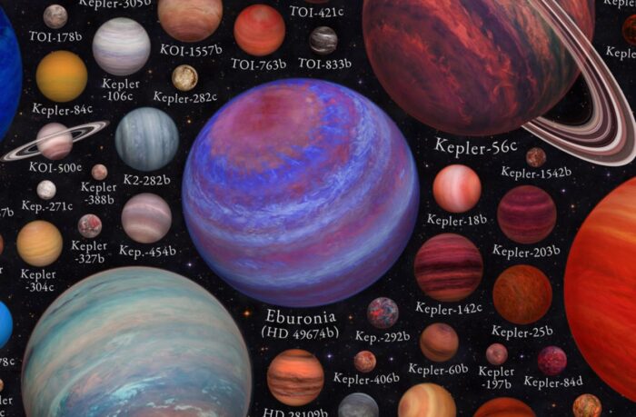
“Data for both exoplanet infographics was gathered from three public exoplanet databases, The Extrasolar Planet Encyclopaedia, NASA Exoplanet Archive and ExoKyoto,” Vargic explained.
The colors of the gas giant exoplanets are based on the Sudarsky Scale. It takes into account the various chemicals and temperatures of planetary atmospheres. Vargic also used existing exoplanet illustrations as a source.
See Martin’s work, including high-resolution versions of his infographics, at halcyonmaps.com.
This article was originally published by Universe Today. Read the original article.




Discussion about this post