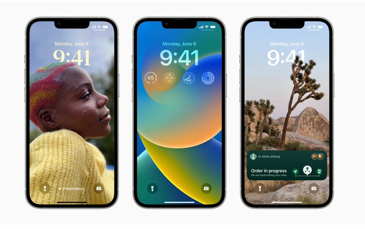
If you’ve switched to iOS 16, you’ve probably already realized Apple has tweaked the system. Notifications now appear at the bottom of the display and there are other changes that must be learned.
We all use them, we all need them
With the recent introduction of iOS 16 and the extent to which mobile pros depend on notifications — and the arrival today of the new iPhone 14 line-up — this is a ood time to look at how Apple has changed the system.
There are two equally valid schools of thought when it comes to notifications.
In one group, you have those for whom notifications are an essential way to maintain at-a-glance insight into people, messages, and app-related events that matter to them. They like to be informed of such things as they happen, but have the determined concentration to remain focused on the matter in hand. They might switch audible notification alerts off, but otherwise they see them as a friendly ambient noise.
The second group consists of those distracted by notifications, who find that they break their chain of thought. They can be a real challenge to some people, generating all kinds of unwanted side impacts.
Life beyond Focus mode
To help navigate the problem, Apple provides Focus Mode, which helps manage the digital overload, hopefully prioritizing what matters above those that don’t. Notification frequency and behavior is important, given the frequently cited 2016 Deloitte study that found people check their phone at least 47 times a day, often in response to these things.
For most of us, notification alerts on our iPhones occupy an important place in our interaction with the device, and increasingly the digital experience is about using the tools at hand in the way that’s best for each of us. I’ve written before about how to use Focus Mode (you can look into that here) — but most mobile professionals must now also learn how to use the new Notifications management tools Apple provides in iOS 16.
So, what’s new?
What’s new in Notifications?
Apple tells us it decided to move notifications to the bottom of the display to reduce clutter on the Lock Screen. If you’ve begun working with iOS 16 (as around 15% of iPhone owners already have, according to Mixpanel data), you’ll note that the move also provides space for the personalization features you can now put in place on your Lock Screen.
[Also read: The quick and easy guide to eSIM on Apple’s iPhone 14]
Notifications still work in a similar way — you can swipe up to view them all, interact with them and more. But there are also new ways to customize what they do, principally with the creation of three different types of notifications, which you choose in Settings>Notifications:
- Count: You only see a a few words on your screen to tell you how many Notifications you’ve received, and you need to swipe up to see them.
- Stack: Notifications are stacked on top of each other by app, and you can swipe up to work through them.
- List: All your notifications in a list, just like they’ve always been.
If you have a love/hate relationship with Notifications, you can swipe down on them when in Stack or List view to immediately convert them to Count view. That’s quite handy if you just want to ignore them for a while, but still want to check them now and then.
Don’t neglect Notification Summary
Apple introduced another useful tool to help control your attention in 2021. Called Notification Summary, it appeared with iOS 15 andvhelps you combine some of your incoming notifications into groups of alerts sent to you at certain times. The idea is that you’ll receive these summaries when it’s convenient to you, helping you to manage your information overload.
It’s useful to think of it like this:
The notifications you really need should be received as and when you receive them; notifications from apps you want to stay on top of but that don’t tend to be urgent should be corralled inside Notifications Summary; and notifications from those apps you never want to hear from should be switched off on a per app basis, again within Notifications.
(It may even be a good time to delete some of those apps if you no longer user them.)
The Summary presents itself as a digest view, made available morning and evening by default, though you can customize time and frequency. When a summary comes in, you need to tap it to see all the notifications it contains. To set it up, just choose Scheduled Summary in Settings>Notifications and enable the feature. You can then schedule delivery times and choose which apps are included in the summary.
Apple helpfully lets you see which apps send you the most notifications in an average day, which may assist in making useful decisions about how you want to proceed.
Striving for a better balance
Moving forward, Apple quite clearly continues to try to find that balance between human productivity, technology, and what we do. Apple CEO Tim Cook has characterized himself as being concerned at the “endless, mindless scrolling” activity so many people have gotten hooked on.
That’s why Apple has Screen Time, and why the company continues to tweak Notifications behavior; it knows those alerts can interfere with focus.
It’s a slightly complex dance, of course, in which most users must strive to find their own balance between inherent ambient connectivity and the need to self-connect. But, like so many things, iPhone users need to spend time making sure they set the device up appropriately, and, for me at least, the new ‘Count’ notification type appears the most discreet.
Please follow me on Twitter, or join me in the AppleHolic’s bar & grill and Apple Discussions groups on MeWe.
Copyright © 2022 IDG Communications, Inc.


Discussion about this post