Ryan Haines / Android Authority
Often imitated, never outdone is an easy way to describe the iPhone’s position among smartphones. It’s clear to see its influence over the best Android devices at all price tiers, bringing features like the notch, flat side rails, and the corner-mounted square camera bump to the forefront as OEMs try to out-iPhone the iPhone. I’d argue that no brand has succeeded, at least until now. Samsung has finally found a way to eat Apple’s lunch by not just drawing from its flagship features but improving upon them. The Samsung Galaxy S23 has become the best iPhone, whether you like it or not.
Does the Samsung Galaxy S23 offer a better experience than the iPhone 14?
3 votes
Good hardware? Or great hardware?
Apple has never had a problem with hardware. One oddly placed Magic Mouse charging port aside, everything out of the Cupertino company is polished down to the last detail. When you pick up an iPhone, you know you’re getting a good mix of glass and aluminum that’s carefully curated inside and out. However, we’re now in an age where good simply isn’t good enough. Year-to-year updates mean that a device needs to offer some form of actual improvement to move the needle.
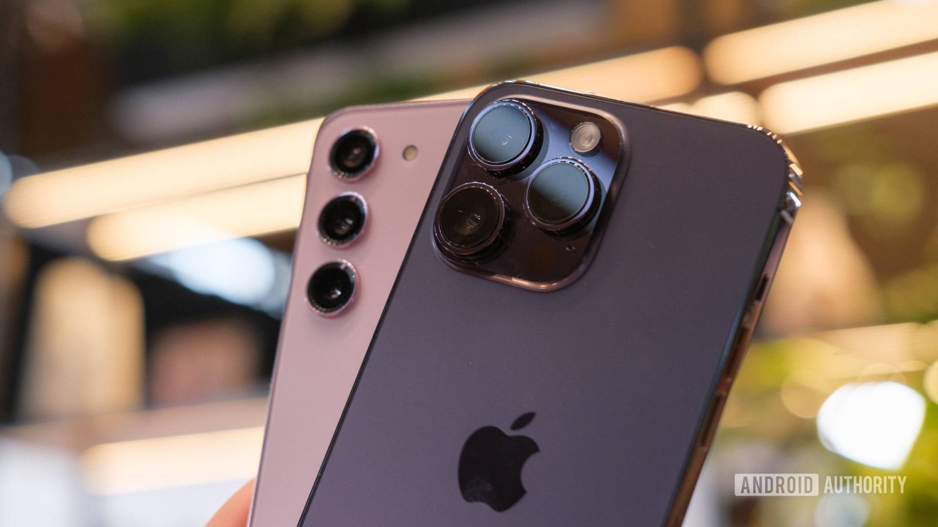
The iPhone 14 doesn’t do that. Instead, it lands almost perfectly in its predecessor’s shoes, hanging onto a dated notched display, uncomfortably industrial side rails, and ditching the SIM tray in the name of, I don’t know, progress? If Apple had the 6.1-inch flagship market locked down, we probably wouldn’t have much room to complain, but it doesn’t. The Samsung Galaxy S23 shows just how good a small phone’s hardware can be, and it trumps Apple at every detail.
Apple’s hardware is polished, but it’s hard to argue it makes much progress.
Nowhere is this more obvious than with the rear cameras. Samsung’s three rear cameras simply offer more control and flexibility than Apple can sniff. Its inclusion of a telephoto shooter allows you to punch in up to 30x, while the iPhone’s wide and ultrawide setup calls it quits at just 5x zoom. Are you likely to use 30x zoom all that often? Probably not, but you’ll probably find that you need to go beyond 5x zoom now and again and will obtain better-looking snaps at 3x to 5x too.
Gorilla Glass Victus 2 and gently curved side rails also bring a level of polish to the Samsung Galaxy S23 we’ve longed for. After a few years of growth spurts, curved displays, and the occasional “glasstic” finish, the Galaxy S23 is premium from top to bottom — and still includes a SIM tray. It’s hard to overstate just how comfortable the rounded design is. I find myself much more willing to hold and use the Galaxy S23 for hours than I would be to use the straight-edge iPhone 14.
The base Galaxy S23 doesn’t feel like settling for less in the way that the iPhone 14 does.
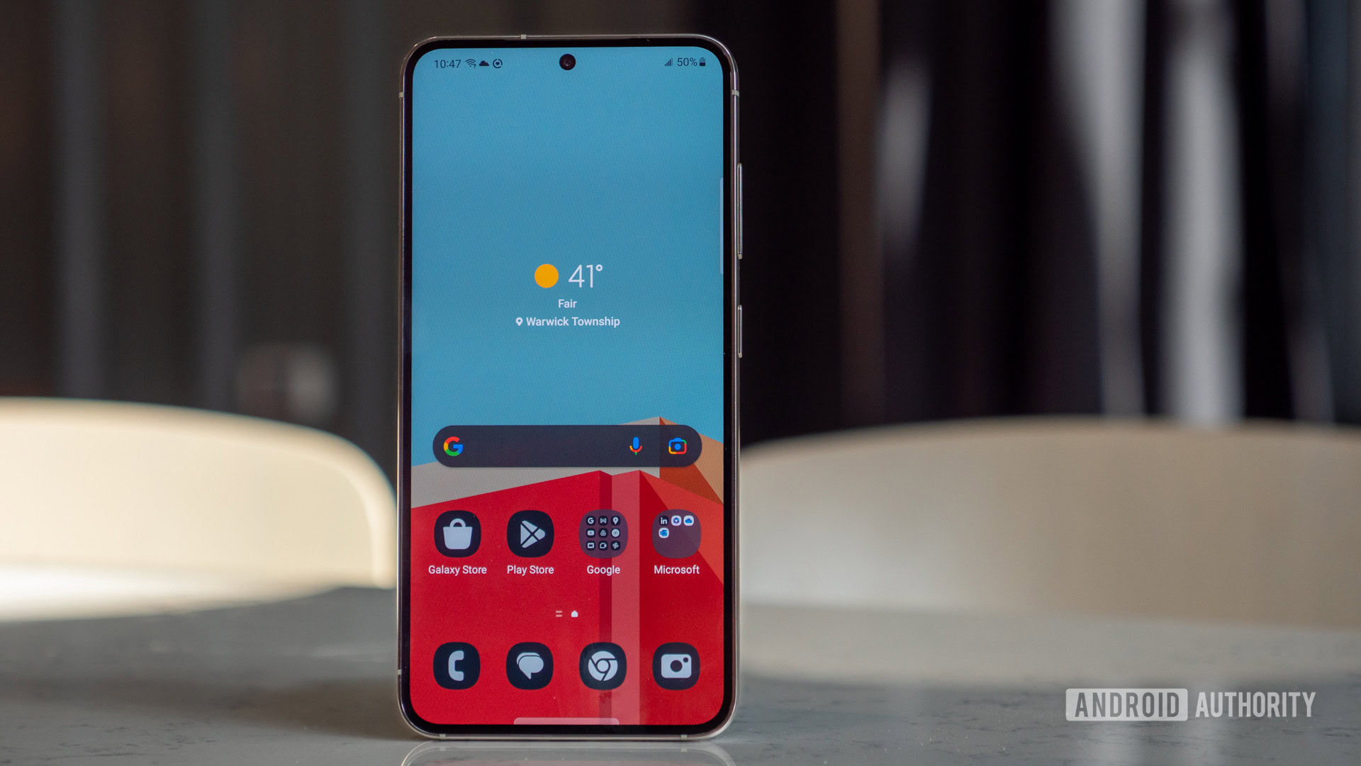
The Galaxy S23’s display outshines the iPhone 14 as well, and we’re not just talking about the unsightly notch. Samsung’s tiny flagship offers up to 1,750 nits of peak brightness, far beyond Apple’s 1,200 mark. Of course, this peak brightness is reserved for select HDR highlights, but small display features go a long way. You don’t have to go pro for a 120Hz refresh rate in the Galaxy ecosystem, either — all three devices hit that high mark. Yes, you’ll get more for your money if you buy the Galaxy S23 Plus or Galaxy S23 Ultra, but the base Galaxy S23 doesn’t feel like settling for less in the way that the iPhone 14 does.
Robert Triggs / Android Authority
What I mean is that now you have to splash — at least — an extra $200 on an iPhone 14 Pro to get the best that Apple actually has. The upper crust moves to Dynamic Island, rocks a telephoto lens (still only up to 15x zoom), and powers through with Apple’s latest A16 Bionic chipset.
Of course, the repeated use of the A15 Bionic chipset doesn’t mean the iPhone 13 redux is all bad. Apple’s 2021 chipset continues to put up blistering benchmarking numbers, rivaling all flavors of the Snapdragon 8 Gen 2 on the Samsung Galaxy S23. However, it does so while emphasizing a double standard within iOS. The base model is no longer good enough for true flagship specs, forcing many people to wait an extra year for long overdue upgrades.
What does iOS really offer?
Ryan Haines / Android Authority
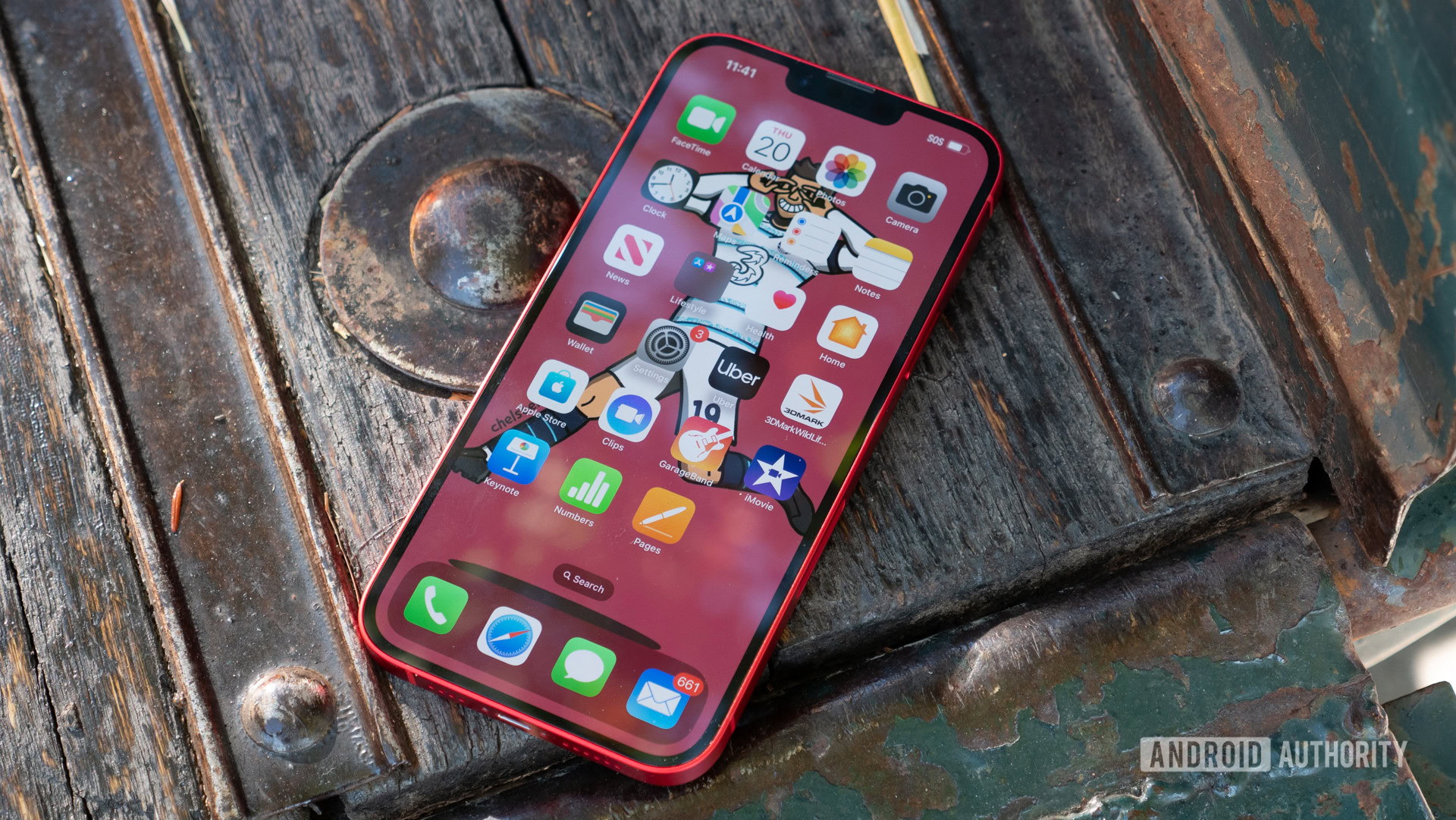
I’ve spent enough time as the black sheep of my friend group to know how much Americans love iMessage. It’s cause for celebration whenever I pop up as a blue bubble for a few weeks rather than my usual green bubble. However, Apple’s flagship messaging app doesn’t really move the needle for the rest of the world. Most people turn to WhatsApp, WeChat, and Telegram to stay in touch, which quickly buffs some of the shine off of Apple’s experience. When you look at iOS more broadly, how much is really memorable about Apple’s current software? I’d argue not much.
Maybe that’s what people love about it. You can pick up an iPhone — any iPhone — and know exactly where everything is. It makes helping your cousin or your grandma with their new phone easy peasy, but it doesn’t make for an exciting experience. Picking up iOS every few months as I do reminds me ironically of the old Android tagline, “be together, not the same,” if only for the fact that Apple lands so far in the opposite direction.
Dipping back into the messaging example, the rest of the world doesn’t care about iMessage. Once you get rid of blue bubbles and green bubbles, you can start to focus on what makes software enjoyable to use. Plenty of developers focus on the iOS versions of apps first, yet their Android counterparts offer much more freedom and flexibility to explore, self-publish, and sideload.
The iOS experience is familiar, but lacks much personal touch.
Sure, you can customize your app icons in iOS, but the process is long and tedious, and you might get tired of it halfway through. Apple has widgets now, too, though it’s hard to argue that there’s much soul in a series of squares and rectangles. I don’t know that Android’s widgets are much more exciting, but at least Google is trying to spice things up with some organic Material You shapes.
I’d argue that perhaps Samsung’s greatest software strength comes from not owning every last granular piece of Android. Instead, the minds at Samsung get to tweak and fine-tune the base software, putting their own spin on the camera app, the settings menus, and the way you can change your Samsung Galaxy S23 home screen layout to match the apps and widgets you really need and hide everything else away. Sure, you end up with needless complications like Galaxy Internet and a second Gallery app, but you also get the freedom to change your launcher and install icon packs in the blink of an eye.
Or, and I can’t believe I’m saying this, but you can put apps at the bottom of your display — right there in thumb’s reach. Yeah, yeah, Apple has its drawer where you can put four favorites, but what happens when you need more than four apps? You have to ballast them down to a reachable height with other apps, folders, and widgets.
The iPhone can optimize its performance like no other, squeezing every last ounce out of smaller batteries and less RAM.
Credit where it’s due, Apple’s control over iOS means it can push software updates long after Samsung has moved on. Samsung’s four years of Android updates and five years of security patches is a noble promise, but Apple continues to be the gold standard. It means that the iPhone can optimize its performance like no other, squeezing every last ounce out of smaller batteries and less RAM while Samsung tries to fit more of each into shrinking phone bodies. But, at the end of the day, would you rather have a phone that lasts forever or one that feels like it reflects your true personality?
The great ecosystem debate
Ryan McLeod / Android Authority
Apple’s walled garden has always reminded me of the children’s book “If You Give a Mouse a Cookie.” Once you buy an iPhone, you’re already on a slippery slope that includes an Apple Watch, an iPad, and a MacBook. After all, why pair an iPhone with a Windows laptop when you can get all of your notifications all the time by staying inside the Apple ecosystem? Some would argue that the iPad is still the best tablet, and the Apple Watch has had years to figure itself out, while Android wearables are still bickering over one common software platform.
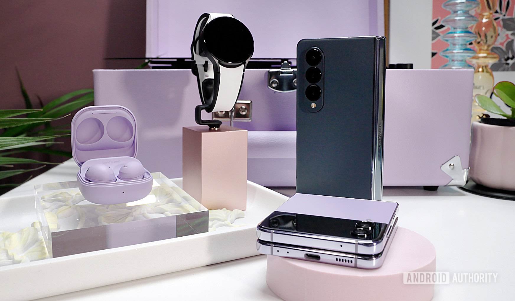
However, while Apple has enjoyed life on top of the podium, sharing notifications back and forth and seamless design across all verticals, Samsung has been undergoing something of a big bang (Get it? Galaxy pun?). The Samsung Galaxy ecosystem now includes a little bit — or maybe a lot — of everything. Samsung has several tablets, Chromebooks, Windows laptops, earbuds, wearables, and a mountain of accessories to choose from. That’s without getting into TVs, electronics, and any imaginable smart home appliance — a world where Apple can’t even begin to compete.
Samsung’s expansive Galaxy now offers more freedom — and just as much quality — as Apple’s walled garden.
Not only has Samsung plunged into just about every one of Apple’s categories, but it’s found ways to improve in many of them. The Galaxy Watch 5 Pro offers multiple days of battery life, while all but the Apple Watch Ultra demand daily trips to the charger. Samsung’s Galaxy Tab lineup often includes a stylus and not one you need to connect with a USB-C to Lightning cable. Even the choice between Windows and Chrome OS brings a certain variety to Samsung, letting you explore what works best for you.
In the end, I think Samsung’s time spent watching Apple create its iPhone juggernaut and seamless ecosystem has done it some good. It’s learned that bigger isn’t always better, that materials aren’t to be messed with, and that the experience surrounding a phone is just as important as the phone itself. All of Samsung’s hard-earned lessons have created a Galaxy S23 that beats the iPhone at its own game, and I have a feeling it will make the smartphone arms race fun again.








Discussion about this post