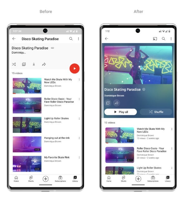
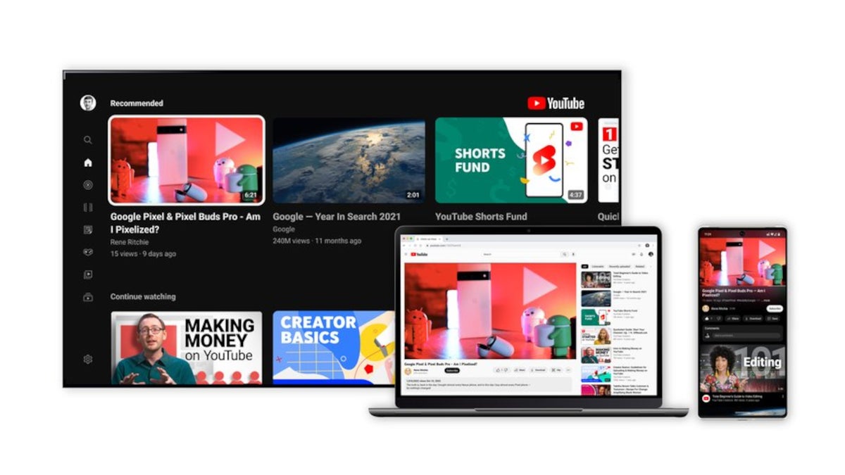
Ambient mode adds a subtle effect, so the app background color adapts to match the video. It’s something discreet that makes so much difference for the viewing experience. On top of that, YouTube confirmed that they have updated the dark theme to be even darker so the colors pop on the screen.
The ambient mode will be available on web and mobile in dark theme, while the latter will be rolled out on web, mobile and smart TVs. And while we’re on the subject, it’s worth noting that video playlists will now adopt the same color changes and show more details about each playlist.
Additional tweaks have been implemented for the video player. For starters, YouTube links in video descriptions will change to buttons, while actions such as like, share and download are formatted to prevent any distractions.
Furthermore, the subscribe button is also getting a redesign to make it stand out. Several new features that have been tested since the beginning of the year are finally being released for everyone. Pinch to zoom and precise seeking are two of the features that are available to all YouTube users starting today.

The former allows users to easily zoom in and out of a video while on their iOS or Android phone. The latter lets you drag or swipe up while seeking to display a row of thumbnails in the video player to find the exact part you’re looking for.
According to YouTube, all the design elements and new features announced recently will be gradually rolled out to all users over the next few weeks, so be patient if they aren’t available for you yet.


Discussion about this post